You will need to create 4 logos.
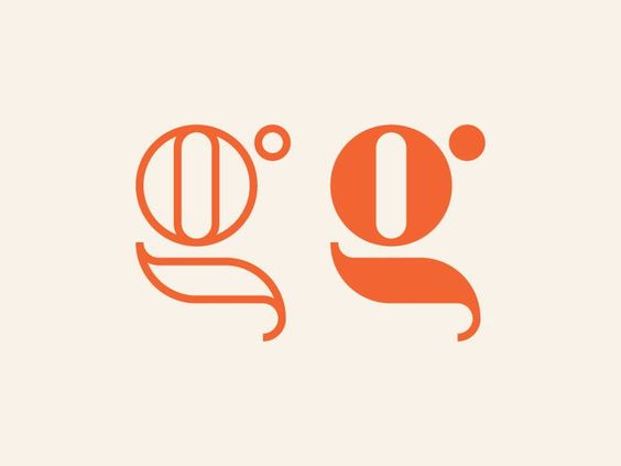
1 Monogram / Lettermark
1 Combination mark (image + your name)
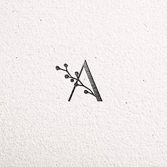
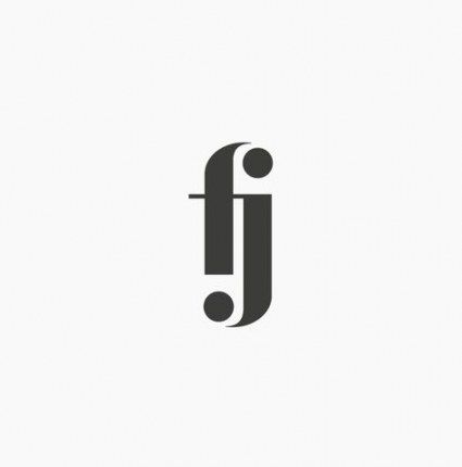
2 symbols (optional to include your name or initials)
Examples of Lettermark/Monogram:


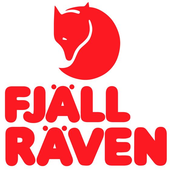
Combination marks: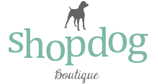


Just symbols:

Just symbols:
Today is our last day in class to finish our illustrated quotes and post them to our online portfolios. If you are finished, I want you researching logo designs for our next project. Check out both of these links: https://rooseveltgraphicarts.wordpress.com/projects/logo-project/examples-of-logos/ and https://rooseveltgraphicarts.wordpress.com/projects/logo-project/
Then search on your own: “simplistic logo design” or “negative space logo design” and “most impressive logo designs” .

After you are finished researching logos, you can work on an independent choice graphics project.
https://rooseveltgraphicarts.wordpress.com/projects/typography/


Envelope Distort>Make with Mesh

What our digital design is lacking that those hand lettered example have is the free flowing shapes of the text. The hand lettering illustrators will draw the words to match required shape, but it takes some skill to plot the letters so they fit perfectly. Instead we can use the Envelope Distort tool to manipulate and tweak the shape of our text until we’re happy. Select the first word and go to Object > Envelope Distort > Make with Mesh.

Add just one row but select a number of columns roughly equal to the number of letters in the word. The more columns there are the more the word can be reshaped, which is important for those words that need to fit into complex areas.

Use the Direct Selection tool to select each point of the mesh and move it into place to manipulate the text into the shape of the silhouette outline. Don’t forget to adjust the bezier handles to generate smooth curves.

Shorter words don’t require as many mesh points because they’re smaller in size. Make just 2 columns for a two letter word.

Some words will require some considerable manipulation to distort them into the required shape. Move those mesh points around to stretch the letters, but try to keep each column of the mesh equal in size so the letters are still evenly spaced.

For words on the second line the mesh points will need manipulating on the top and bottom so the word follows the flow between the existing text and the silhouette outline.


