You will need a gradient and/or shadow on each of your 3 Minimal posters. Try to keep both textures and gradients subtle.
You can watch the following tutorials if you want more experience with gradients and textures. I have saved textures you can use in the folder: Shared > Students > Fine Art > Lessons 6-10 > Textures. Select a texture you like and Ctrl + C to copy and Ctrl + V to paste on your Minimal Poster.
Texture Tutorial
Gradient Tutorial


When you are finished with Mr. Potato Head and uploading it to your blog (Directions on post below), you may spend the class period brainstorming, researching, and sketching for our next project: Minimal movie poster.
1. List your favorite movies, tv shows, and books:
2. List objects and characters from your favorite movies:
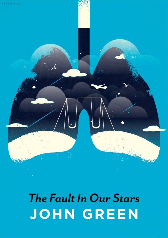
Outline for Minimal Poster project:
https://rooseveltgraphicarts.wordpress.com/projects/minimal-movie-poster/
How will you make your images minimal? Remember, use a photograph as a reference image – do not simply copy an existing minimal poster.


When you are finished with your Mr. Potato Head project, Follow the instructions below to upload your image to your blog:
1. Hide your reference image.
2. Unlock all layers.
3. Make a selection of every piece.
4. Hold down shift while increasing the size.
5. Resize your art board to fit your image.
6. File > Export > JPEG
7. Color Model: RGB and Quality: 10 Maximum
Good Morning! Today we will post our choice line practices to our blog and start our Mr. Potato Head practice. We will be focused on Shapes (shapes of different colors), Pen Tool precision (as limited anchor points as possible), and using Layers efficiently (Ear layer, Ear highlights, Ear shadows, etc.).
Directions for posting line practices to blog:
Open your line practice document.
Hide your reference layer
Resize your artboard if needed 
File > Export and save your file as a JPEG
Log in to your blog and post your these images to your blog.
Directions for Potato head below:
Find the JPEG file Titled “Mr. Potato Head” in the folder:
Shared >Students >Fine Art >Pen Practice.
Drag this image to your home folder.

- Open a new Illustrator document.
- File> Place the Mr. Potato image on your Artboard.
- Name this layer reference image and lock it.
- Create a new layer name “Body” and trace the outline of the potato.
- Using the Eyedropper tool, fill this shape you made by clicking the potato color.
- Lock and hide this layer.
- Create a new layer named “Eye and Mustache layer”.
- Trace around the white eye shapes and black mustache shape.
- Use the Eyedropper tool to fill these shapes.
- Lock and hide this layer.
- Create a new layer named “Pupil and mustache highlights”.
- Continue working this way.


This example has too many anchor points used and not clean shapes:

You will create and publish your first blog post today. Find 1 image from the Webquest that best represents the element of line and 1 that is your overall favorite. Upload your images to a post and describe the lines in the first design and explain why you like the second image.
When you are finished, click publish and you may continue to work on the pen tool exercise 5.3 or the line project of your choice.
If you are having trouble finding examples of lines, ask Mrs. Carmany.
Examples:


There are repeated scribble-like lines surrounding the portrait on the magazine cover. The font also matches these lines. Some lines are black to stand out against the light background and some are white to stand out against the blue floor.


Line is a dominant element in this album cover design. The lines very in color and direction. The name of the band Iron and Wine is also composed of lines.
I like this typography design over the photograph. 
I love the colors in this image and how simplistic the cactus is. 


